What I was responsible for?
User Research
Usability Testing
Prototyping

In today's competitive business landscape, good UX is vital to business success for several compelling reasons, all of which contribute to long-term growth, customer retention, and a stronger brand reputation. So let's take a look at how I produced Skyward Air.
Role:
User Research, UX/UI, Competitor Analysis, Usability Test
Timeframe:
3 Months
Tools:
Lookback, Notion, Figma, Pages
TL;DR
Overview
Skyward Air is a mobile-first flight booking experience designed to reduce stress and boost confidence for users booking travel. Created as part of my UX Design Diploma, this project tackled key user frustrations with current airline apps - from confusing flight types and overwhelming interfaces to fragmented calendar flows.
The Challenge
Users frequently struggled with identifying direct flights, navigating the cluttered UI's, and understanding pricing or availability when selecting travel dates. These frustrations led to backtracking, misbookings, and decision fatigue, especially for neurodiverse users.
My Approach
Through competitive analysis, qualitative testing, and journey mapping, I uncovered core friction points in the booking experience. I used this insight to:
Introduce intuitive flight filters and clear “Direct” visual tags
Simplify the interface with a strong visual hierarchy and space
Redesign the calendar to show pricing, availability, and trip duration at a glance
The Outcome
The result is a calm, user-centred app that simplifies flight booking into a seamless, informative, and confidence-boosting experience. Usability testing confirmed improved clarity, faster decision-making, and reduced cognitive load. Skyward Air empowers users to feel in control at every journey step, with options based on their preferences.
What's the Problem?
✈️ Problem 1: Flight Confusion & Misdirection
“I thought I booked a direct flight - why does it have a stopover?”
“I didn’t like that they were showing flights that are not available with shorter travel times; that’s annoying. Same with the business class fare, it’s unnecessary information.” - Usability Test Participant
In testing, users frequently misunderstood whether their selected flights were direct or had stopovers. Key friction points:
The layout and overwhelming screens meant the user missed important information.
Users often didn’t realise until the summary screen that a layover was included.
Outbound and return flights were visually similar, with no transition, making trip directions unclear.
➡️ Result: Frustration, backtracking, and reduced confidence in the booking process
🎯 Design Goals
Ensure users can clearly distinguish between direct and indirect flights
Make outbound and return trip information more intuitive
Show available flights only
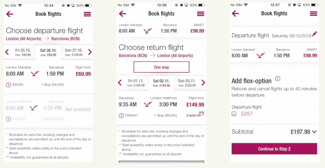
🧠 Problem 2: Visual Overload
“I don’t like their colours, the whole process, the calendar, even the initial welcome screen. It’s very busy.”
- Usability Test Participant
Users described the interface as cluttered and difficult to navigate. Key issues:
Too many visual elements fighting for attention
A loud colour palette causing distraction
Little to no spacing between flight options
Important information (like stopovers) was overlooked
➡️ Result: Missed details, longer decision-making time, and user frustration.
🎯 Design Goals
Create a calmer, more digestible interface
Improve scalability of flight options
Reduce cognitive load, especially for neurodiverse users
Make key flight info more visible and accessible

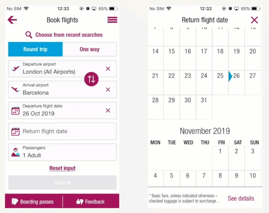
✈️ Problem 3: Calendar – Disconnected, Confusing, and Lacking Insight
“I forgot what date I picked for departure… I wish I could see both.”
“Can I book this date? I’m not sure what’s available.”
“It would be so much easier if I could see which days were cheaper right away.”
- Usability Test Participant
During usability testing via mobile booking experience, I observed recurring friction around the calendar feature, an essential part of the booking flow. Users found the date selection experience confusing, fragmented, and unintuitive. Three core pain points emerged:
The departure and return calendars are opened in separate windows.
There was no clear distinction between available, unavailable and selected dates.
The calendar lacked in-line price indicators for available flights.
➡️ Result: User frustration, backtracking and trial and error to find the cheapest dates.
🎯 Design Goals
To transform the calendar into a more intuitive, efficient, and user-friendly experience, I focused on three primary design goals:
Design a single calendar view that allows users to select both departure and return dates without switching contexts.
Use colour-coded visual indicators and states (e.g., disabled, selected, available) to reduce uncertainty.
Display the lowest available prices directly on each date, helping users make faster, informed decisions without toggling back and forth.
📋 Research, Research, Research: Laying the Groundwork for Design
To kick off the project, I conducted three essential qualitative research methods: competitive benchmarking, note-taking, and usability tests. These research initiatives allowed me to uncover valuable insights into user behaviours, frustrations, and expectations, helping me identify patterns and pain points that would influence my design decisions.
By synthesising the data gathered, I established a solid foundation for the upcoming design phase. This research not only informed my design choices but also sharpened my analytical skills, helping me draw actionable conclusions. These competencies became crucial as I continued to refine and navigate the remainder of the UX process, ensuring that each step was grounded in user-centred insights.
📊 Competitive Benchmarking: Understanding Industry Leaders
The first step in my research phase was Competitive Benchmarking, where I performed an in-depth analysis of Skyscanner, British Airways, EasyJet, and American Airlines. These companies were chosen for their established presence in the industry and their strong customer loyalty. Skyscanner, in particular, stood out for its unique position as a flight aggregator, offering a wide range of flight options to travellers.

I compiled a comprehensive document that outlined the strengths and weaknesses of each airline’s mobile app, while also identifying key areas for potential improvement.
This analysis allowed me to gain a deeper understanding of industry best practices and user preferences, enabling me to uncover opportunities to differentiate my design. Ultimately, this benchmarking process ensured my design would not only meet user expectations but also stand out in an increasingly competitive market.

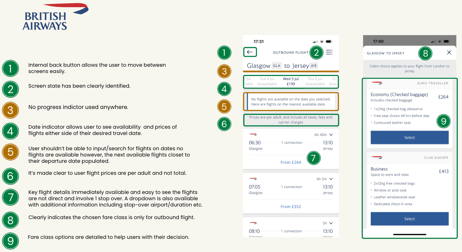
🔍 Process Analysis: Identifying Strengths & Weaknesses
I conducted a step-by-step analysis of the flight booking process across multiple airline apps to benchmark best practices and uncover areas for improvement.
✨ Key Insights
Clear Stage Labelling: All apps effectively label steps like "Select Dates," helping users understand their progress.
Frictionless Airport Selection: Most apps allow users to select airports in just 3 taps - quicker, smoother journeys.
Unified Date Selection: Single-screen calendars reduced friction and made date selection feel seamless.
In-Calendar Pricing: Visible, consistent pricing in calendar views supported better, more confident decision-making.
Search Clutter: Some apps suggested irrelevant airports, leading to user confusion, highlighting the need for smarter autocomplete.
Value-Added Info: Apps with travel health info and visa reminders enhanced the user experience with timely, helpful guidance.
✨ Note-Taking: Capturing Key Insights
🎯 Objective
To identify pain points and user behaviour during flight booking on two mobile apps: Eurowings and Aer Lingus.
👥 Participants
A full-time mother of three, also caring for her elderly parent
A young single male professional in his 20s
These profiles offered diverse perspectives across age, lifestyle, and tech familiarity.
🧪 Method
Each participant completed the same booking task (same departure, destination, and dates) to ensure a fair comparison between platforms.
🔍 Focus Areas
User context & Mindset
Interaction behavior
Positive moments
Pain points
User expectations & feedback
📝 Key Findings
Pain Points
Flight Type Confusion: Unclear if selected flights were direct or had stopovers
“I’m very confused. Am I booking a direct flight? It’s not clear.”
Lack of Detail: No info on stopover locations or durations
Overwhelming Interface: Busy visuals and poor hierarchy
“The whole process, the colours, the calendar – it’s very busy.”
Likes
Clarity on fare breakdown when selecting additional options
“I liked the way it showed additional fares when you clicked on it.”
Dislikes
Inaccessible options unless familiar with the app
Showing unavailable or irrelevant flights (e.g., business class)
Confusing visual design and colour scheme
Expected Features
A clear indication of direct vs. stopover flights
Stopover details (location, time) are visible upfront
💡 Usability Testing: Gathering Real-Life Insights
At this stage, I conducted an independent, real-life usability test. To ensure the process was structured and the key tasks were completed, I used a detailed test script. This script helped gather the necessary background information, kept the test on track, and covered all essential tasks.
Before running the test, I selected two airlines for comparison: EasyJet and British Airways. These two platforms offered distinct user experiences, making them an ideal choice for capturing varied insights. The tests provided valuable qualitative data, which I used to inform and refine my product design decisions.
With the usability testing complete, I moved on to analysing the data I had collected and transforming it into actionable insights. This marked the transition from research to design, and I began organising my findings through the creation of an Affinity Diagram.
🧺 Affinity Diagram: Organising Insights for Actionable Design
To begin the affinity diagram process, I grouped all the insights I had gathered from the usability tests. I created a colour-coded key to visualise the data quickly, as well as marking each note with a specific colour using the traffic light system to quickly identify its impact.
Challenges Identified
Lack of Clarity Around Flight Details
Users were often unsure whether their selected flights were direct or included stopovers. This confusion typically surfaced too late in the booking process, leading to frustration. There was also ambiguity between outbound and return flights.Visual Clutter Causing Mental Overload
The interface was described as visually overwhelming, with a lack of white space and a heavy colour scheme. This clutter made it harder for users to process information, causing them to miss important flight details.Disjointed and Confusing Calendar Interaction
Users struggled with date selection due to separate windows for departure and return calendars. The absence of price previews and unclear availability made it difficult to plan confidently.
Key Insights & Positive Patterns
In addition to identifying usability issues, the affinity diagram revealed several features that users responded positively to. I aimed to preserve and build on these strengths in the redesign:
Helpful Sorting Options for Flights
Users appreciated having the ability to sort flights by criteria such as “Best,” “Fastest,” or “Price: Low to High.” This gave them more control over how they browsed options and made decision-making feel smoother.Transparent Pricing Per Adult
Users felt reassured when the pricing was clearly stated as “per adult.” This simple confirmation reduced uncertainty and built trust early in the booking process.Smart Seat Selection Shortcut
The option to “Choose the same seats on all flights if available” was seen as a time-saver and a thoughtful touch. Users liked not having to repeat the same selection for each leg of their trip.


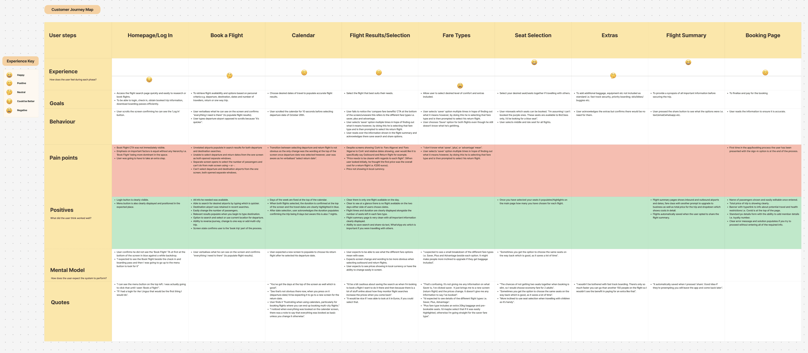
🗺️ Customer Journey Map: Visualising the User's Experience
Mapping the customer journey for Skyward Air revealed that users experienced a mixed and often frustrating booking process, with confusion beginning from the very first interaction and persisting through to checkout. The journey lacked intuitive flows, clarity around key information, and missed early opportunities to build trust.
Key Pain Points by Stage
🛬 Homepage
The primary CTA, "Book Flight", wasn’t immediately visible, reducing momentum at the very start.
Lack of hierarchy in visual design meant all elements had equal emphasis - users didn’t know where to focus.
The process felt indirect, requiring unnecessary extra steps before flight selection.
🧭 Book a Flight
Unrelated airports appeared in search results, creating confusion and slowing progress.
Users had to open separate windows to select departure and destination airports, breaking the flow.
Selecting passengers required navigating to another screen; simple plus/minus controls weren’t available.
There was no filter for direct flights, frustrating users who preferred non-stop options.
📆 Calendar Experience
The transition between departure and return date selection was subtle and unclear.
Users couldn’t see which dates were available or how prices varied, leading to guesswork.
The calendar lacked price indicators, making it harder to find the best value flights.
🛫 Flight Results
Flights were labelled with locations and dates, but users wanted clear "Outbound" and "Return" tags.
Pricing was ambiguous—users assumed the first price shown was the total round-trip cost.
Local currency wasn’t displayed, reducing trust and clarity.
🎟 Fare Type Confusion
Terms like "Saver," "Plus," and "Advantage" were unclear. Users clicked blindly, trying to find definitions, but unintentionally selected options without understanding them.
Users clicked fare types (e.g., "Saver") to understand them, but that action selected the fare and pushed them into the return flight selection.
🔒 Booking Page
The sign-in prompt appeared only at the final stage of the process. Users are expected to create or log into an account earlier for ease of tracking or autofill.
💡 Takeaway
The journey map highlighted that a lack of clarity, disjointed flows, and missing feedback mechanisms created friction at nearly every step. Users needed fewer steps, more transparency, and a clearer visual hierarchy to feel in control. These findings heavily influenced the redesign strategy, shifting focus toward simplifying flows, clarifying content, and streamlining decision-making touchpoints.
🧩 Problem-Solving - Designing the Solution
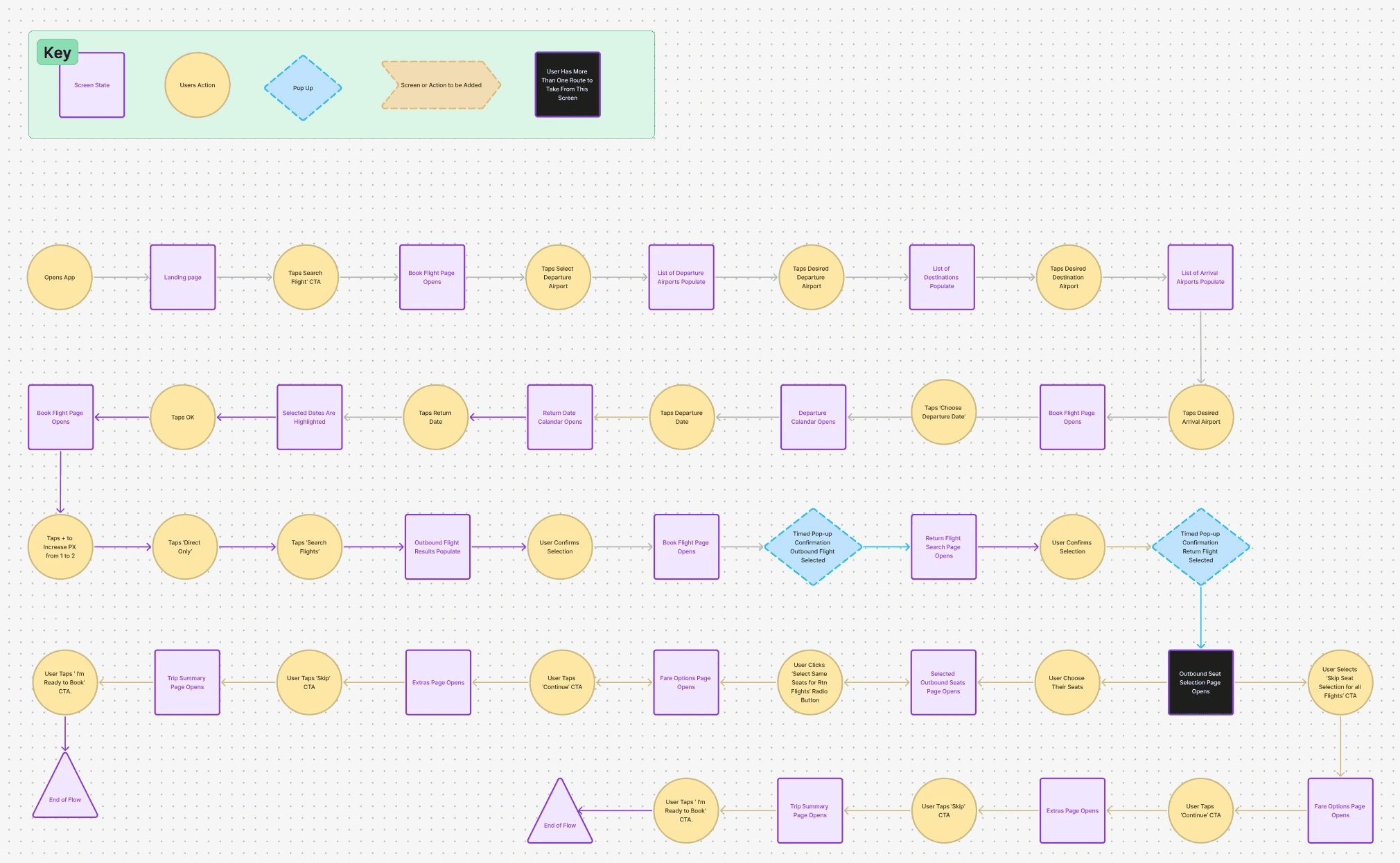
🔍 Flow Diagram - Key Findings
Flow Challenges (Before the Redesign)
Based on usability testing and user feedback, I identified several points of friction in the original user flow:
Disjointed navigation: Users were often taken back a step unexpectedly, disrupting their mental model of progress.
Too many taps: Users had to take more actions than necessary to complete simple tasks, such as selecting a flight or confirming dates.
Unclear calendar interaction: Users weren't confident that their selection had been registered.
Lack of feedback or indicators: Users were unsure where they were in the booking process, leading to hesitation or drop-off.
💬 User Quotes:
“Why am I being taken back a step when I’m trying to move forward?”
“There are just too many screens for one thing.”
“I wasn’t sure if the date had been selected or not.”
Design Responses (After the Redesign)
To mitigate these issues, I redesigned the user flow to reduce friction and align more closely with user expectations:
Created a linear, guided booking flow with clear forward momentum and no unnecessary loops.
Reduced the number of screens and taps required to complete each step.
Improved date selection UI with instant visual feedback and confirmation.
Introduced progress indicators so users always know where they are in the journey.
🔧 Impact in Huerstics:
These changes removed the confusion and hesitation users previously expressed, creating a smoother experience and a more efficient path to booking.
Match Between the System and the Real World
Problem: Users experienced unexpected navigation (e.g. being taken back a step), which broke their mental model.
Design response: Created a linear, intuitive flow that follows a natural user progression.
User Control and Freedom
Problem: Users felt stuck or misdirected when trying to go forward, but were taken backwards instead.
Design response: Clear navigation paths and the ability to undo or revise selections help restore control.
Consistency and Standards
Problem: Inconsistencies in interactions (like ambiguous date selection) are confusing.
Design response: Standardised interactions with familiar patterns and feedback mechanisms.
Visibility of System Status
Problem: Users were unsure where they were in the process and whether actions (like date selection) were successful.
Design response: Added progress indicators and immediate feedback for each user action.
Error Prevention
Problem: Disjointed flows and extra taps increased cognitive load and the risk of user error.
Design response: Streamlined steps reduce the chance of mistakes and increase flow efficiency.
Recognition Rather Than Recall
Problem: Users had to remember previous selections without visual cues or context.
Design response: Visible confirmations and progress tracking support recognition.
✅ Solution 1: Clear Flight Labels & Visual Reinforcement
1. Direct Flight Filter
Added a radio button for users to tick to search for 'Direct Only' flights.
We have added another option to allow the user to filter 'Direct' flights in search results if they forget to tick the radio button.
Users can now instantly filter out any stopover journeys.
Helped time-sensitive travellers make quicker decisions.
2. Flight Type Clarity
Separated into “Outbound” and “Return” sections with headers whilst maintaining one screen selection.
Introduced a 'Direct' visual tag on each flight card.
Split flights into two clear sections: “Outbound Flight” and “Return Flight” with confirmation upon selection.
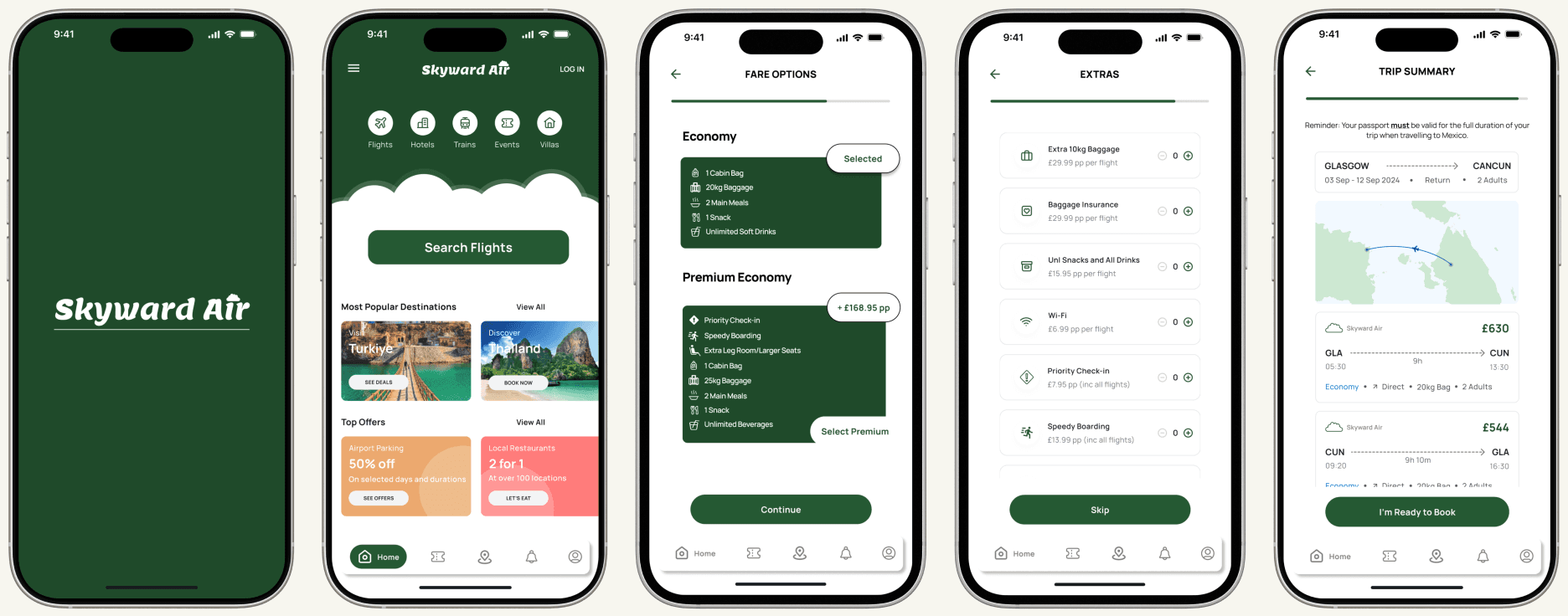
3. Fare Class Clarity
Made clear the travel class on the flight card.
Fare class is displayed as a hyperlink pop-up when clicked, which confirms what's included.
The hyperlink shows the chosen fare class and other available fare classes.

✅ Solution 2: Calmer Interface Through Visual Hierarchy and Space
To address this issue, I focused on creating a cleaner, more digestible visual environment that guides user attention and reduces decision fatigue.
🧘♀️ Reduced Clutter & Strategic White Space
Re-evaluated the layout and removed unnecessary visual elements and dividers to reduce noise.
Introduced intentional white space between sections (flight cards, filters, CTA buttons) to give each element room to breathe and be processed independently.
Grouped related content visually to support quick recognition and minimise scanning effort.
🔍 Focused Information Display
Simplified each flight card by highlighting the most essential details as the immediate focus: airline, departure/arrival times, price, and flight type indicator.
Secondary info - baggage allowance, fare class, flight type, number of px, etc sits at the base of the flight card to help with selection without providing overwhelm.
Applied a clear visual hierarchy using typography weight, size, and colour contrast so that users could quickly find what mattered most to them.
🎨 Refined Colour Palette
Replaced the overstimulating colour scheme with a calmer, more cohesive palette using green and neutrals, improving focus and readability.
Used a single accent colour sparingly for primary CTAS to guide user flow without overwhelming the screen.
✅ Solution 3: Redesigning the Calendar for Clarity and Confidence
To enhance the user experience, I redesigned the calendar with a focus on clarity, continuity, and decision support:
👉 Unified Date Selection
Combined the departure and return date pickers into a single screen, allowing users to see the entire trip dates and duration at once.
This seamless layout helps users better visualise their overall travel timeline, reducing confusion and improving the speed of selection.
📅 Availability Indicators
Introduced clear visual cues (such as light grey for unavailable dates and white background with prices for available dates).
Added the days of the week into the view, allowing users to quickly see if their preferred travel day was available.
💸 Price Preview Integration
Displayed starting prices directly on the calendar using subtle text beneath each date, allowing users to make cost-conscious decisions without navigating away.
✨ Visual Confirmation of Selection
Once users selected dates, a highlighted date range bar appeared with departure and return dates visually linked.
Added additional confirmation (e.g., 10-night trip from 3rd - 12th September) above the calendar for reassurance.
The user is only able to progress the /progress button, only highlighted when both dates are selected.

💥 Impact of Changes
The final usability session surfaced a few minor adjustments to improve clarity and user confidence:
Flight Booking Layout: The user initially expected "One Way" on the left and "Return" on the right, but quickly adapted, recognising that return is the industry norm.
Label Clarity: "Select Arrival Airport" caused momentary confusion - the term "Destination" was seen as more intuitive.
Trip Summary Visibility: The user's preferred travel dates are shown on or above each flight card, not just at the top of the page, for quicker reference.
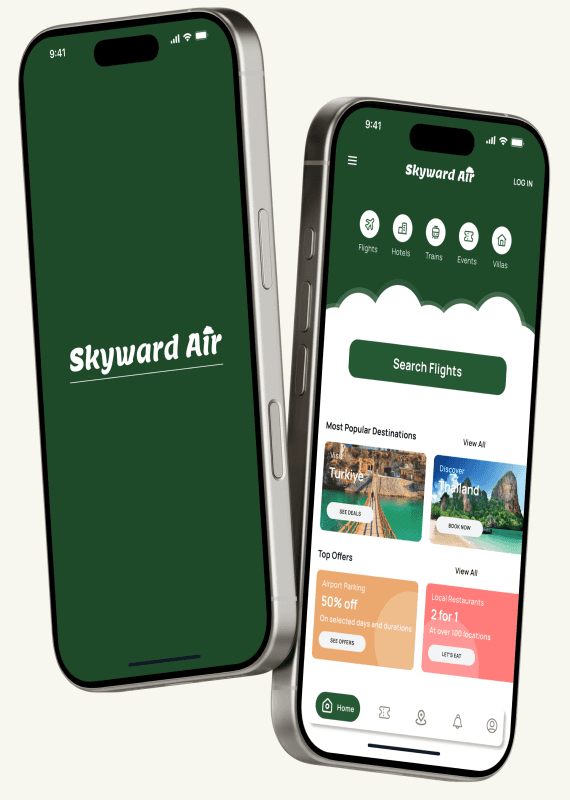
Overall Experience: The flow was described as simple, seamless, and visually calming. However, the colour scheme gave the impression that it was an Irish airline, which may influence brand perception.
View Prototype
✨ Conclusion
The Skyward Air project has been an insightful journey in understanding and addressing the needs of users navigating the flight booking process. By conducting comprehensive research, including competitive benchmarking, usability tests, and affinity diagrams, I was able to uncover key user frustrations and areas of improvement in the flight selection process. The challenges identified—such as confusion over direct flights, mental overload from cluttered interfaces, and difficulties in selecting dates—were all systematically addressed through thoughtful design solutions.
By refining the flow, improving clarity, and incorporating features like direct flight filters, reduced clutter, and an intuitive calendar design, I was able to create a more streamlined and user-friendly experience. Each decision was informed by direct user feedback and data, ensuring that the final design aligned with their needs and expectations.
Through this process, I not only enhanced my understanding of UX principles and methodologies but also developed a more empathetic approach to design, always prioritising the user’s experience.
The Skyward Air project has reinforced the importance of iterative design, continuous user testing, and the value of a clear, engaging interface in driving successful outcomes.